Modal
Modals inform users about a task and can contain decisive information that requires immediate attention.
Use a modal when required to interrupt the user to address a specific critical task that needs immediate resolution.
When to use a modal:
- To grab user’s attention for an important message.
- To show additional information without losing the context of the parent page.
- To break down a complex workflow into a series of less complicated steps.
When not to use a modal:
- For nonessential information that is not related to the current workflow.
- For complex workflows that require additional information not contained within the modal.
- Avoid modal over modal. Context becomes confusing when modals are stacked.
There are multiple sizes for modals. The default size is medium, however other sizes are available. Select the size best suited for the content and screen size displaying the modal. Remember to test responsiveness.
Consider using modals for the following scenarios: alerting the user, confirmation dialogs, and task-oriented workflows.
A user needs to actively dismiss a modal. A modal should not disappear on its own. Taking any of the actions to either cancel or proceed should eventually dismiss the modal.
There are multiple ways to dismiss a modal but a user needs to intentionally make that choice.
Clarity modals are not dismissed when clicking on the background overlay. This prevents losing information or data. An option to override this is available.
Modals should not launch other modals. Stacking modals makes it hard to dismiss them and confuses the user on their levels of importance.
If you see a need to stack modals, you should:
- Seek alternatives to the second modal such as inline expansion within the first one.
- Seek alternatives to the use of modals in that scenario and explore alternatives such as inline task completion.
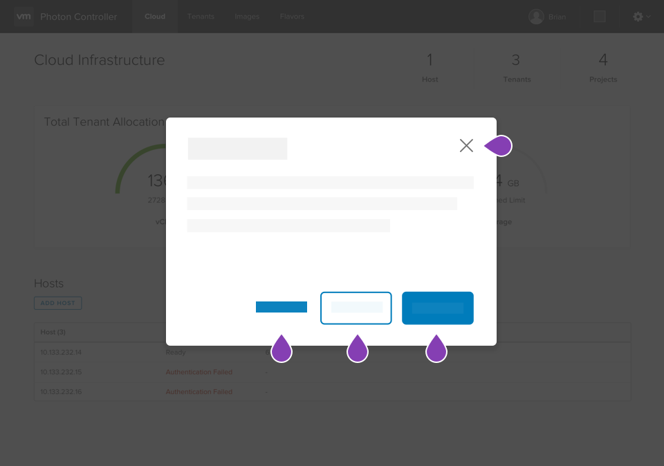
As demonstrated in the examples above, the VMware Accessibility team recommends forcing focus to the title of a modal when it is first opened. This is accomplished by adding the cds-first-focus attribute and a tabindex of -1 to the header in the modal.
Note that the cds-first-focus attribute can be used to draw focus to any element inside a modal when it is first opened. If the element is not normally focusable (like the header tag mentioned previously), you will also need to assign a tabindex to the element.