Button
Buttons allow an application to communicate action and direct user intent.
Clarity comes with three different types of buttons to use. They are provided to give visual distinction between the priority or heirarchy of the buttons in the application.
Solid buttons look heavy on purpose. They direct the user’s attention to the primary action the application is suggesting that the user take.
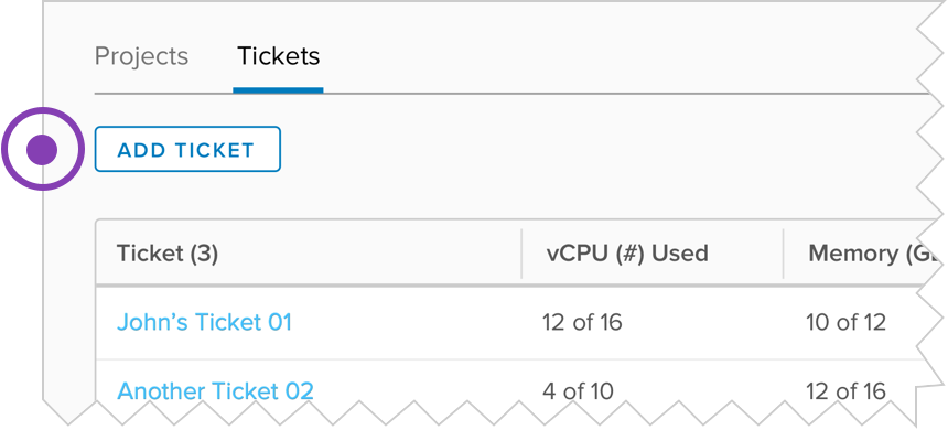
Outline buttons provide a lighter weight button style. They are used to indicate a secondary action that compliments a primary action or to reduce visual noise when there are many actions of equal importance on the page.
Flat buttons are used in multiple scenarios. They are used as tertiary buttons. They can also be used inline because they are different from content in style and recognizable as buttons alongside content.
While buttons and links can both be given similar visual treatments, it is important that you use a link (or anchor element) for anytime clicking the element will navigate you to a different page. Buttons are for interaction in the current page, such as refreshing the content or submitting a form.
There are two distinct patterns when it comes to the placement of a button.

Z Pattern
The Z-pattern is a natural way for the user to go through content within a constrained container and when tasks are oriented from the top-left and ending with a primary call to action on the right bottom side of the container. This pattern is reversed for right to left languages.

F Pattern
The F-pattern is a natural way to go through content in an unconstrained container, such as a form on the page itself. The user will go through the content line-by-line, arriving at a call to action at the end.
Consistent button styles make it easier for a user to recognize areas to take action across an application.
The text inside of buttons is always uppercase. This indicates action by differentiating button text from links and other content on the page. Use descriptive language on buttons relating to the user’s intent.

Use a call to action on buttons.

Use generic language not related to the action and not relating to the intent of the user.
Clarity buttons have several distinct properties and design considerations.
Clarity buttons have a border radius of 3px.
Clarity offers two button sizes:
- Default height of 1.8rem (36px)
- Compact height of 1.2rem (24px)
Compact is used in content areas where smaller buttons are needed to de-emphasize calls to action. This is especially true when multiple actions of equal importance are available.
A primary color provides consistency across an application. It trains the user to look for that color when trying to find an action. Clarity defaults to blue. This “action blue” can be found across all types of buttons, tabs, and other action-related components.
Icons can be used inside buttons to decorate the call-to-action with a visual indicator. Icons should be used alongside text that clearly indicates what the interaction is expected to do.
Icons can be placed to the left or right of the button text. Icons should only appear on the right of the text if the call-to-action would extend outside of the current context, however. Examples include downloading a file, opening a new window, or navigating the user to a page outside the application.
Buttons should only use icons by themselves if an interface is constrained by space. Using only an icon, and no text, in a button requires the use of the icon button component.
Badges can be used inside buttons to indicate a known number of items associated with an action. This can help the user understand the impact or severity of the call-to-action. Badges always appear to the right of the text in an ltr presentation.
Buttons have built-in loading and disabled states.
Use the button's loading state when you need to communicate that the application is working on a call-to-action a user has iniated by clicking on the button. Use the error state when a call-to-action has failed to complete. Use the success state when a call-to-action has completed successfully.A button may remain in the success state if a call-to-action is only intended to be performed once.
All three states (loading, error, and success) prevent further execution of the call-to-action.
Buttons may be disabled to indicate to a user that the call-to-action is unavailable. It should be clear to the user why a button is disabled, however, and users should be directed how enable the call-to-action if that is possible.